Elliot Xiao Zhang
Biography
Hi, I’m Elliot, a multidisciplinary visual communicator from China.
My experiences span across branding visual identity, motion design, typography, UI and illustration. My passion lies in using various mediums to convey touching messages.
I believe the world is a puzzle pieced together by everyone’s perception of it. So I want to share my unique piece with you. Let’s create something remarkable together. 🧩
Email address
moc.kooltuo@ngisedoaixgnahzWeb Portfolio
zhangxiaodesign.comPortfolio
{The Dynamic Boundary}
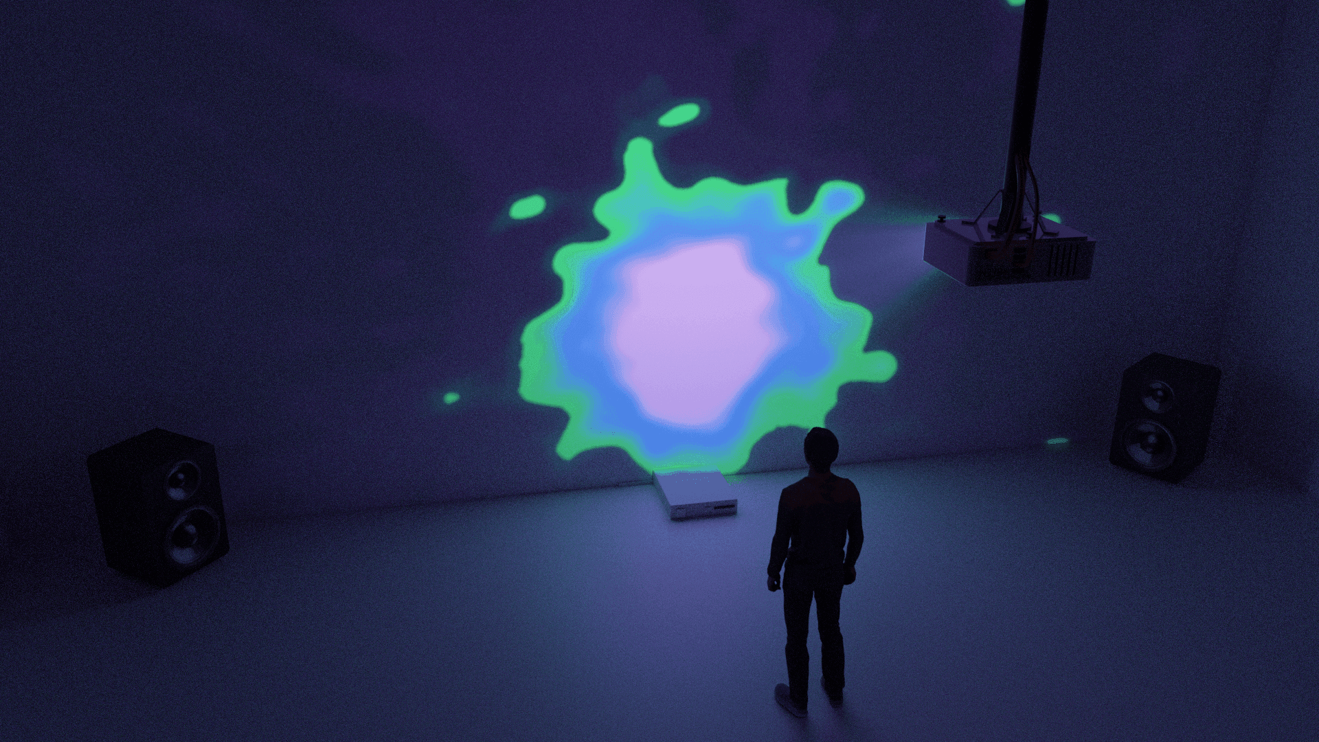
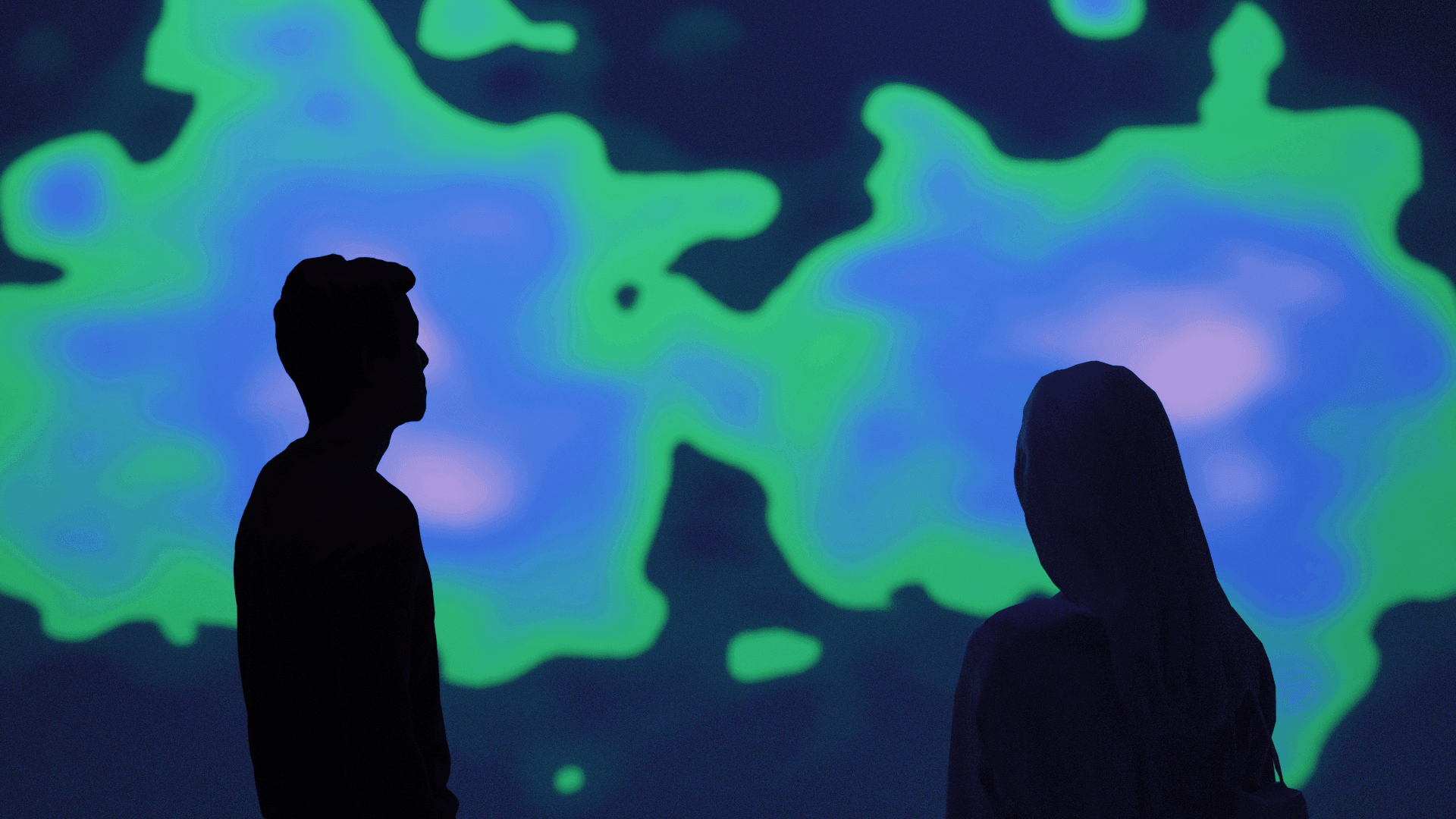
{The Dynamic Boundary} is an interactive projection installation that uses the concept of cellular aggregation and evolution as a metaphor to explore the evolving boundaries between “us” and “others” in both time and space.
The installation consists of projected visuals that depict continuously developing cells, symbolising the individual entities that comprise a collective whole. Audiences can actively engage with the installation, becoming a cell within the projection and interacting with others in the space to create connections. Through this interactive experience, viewers are invited to contemplate the fluidity of identity, the formation of communities, and to critically reevaluate the dynamic boundaries that separate “us” from “others”.
FolDer Magazine
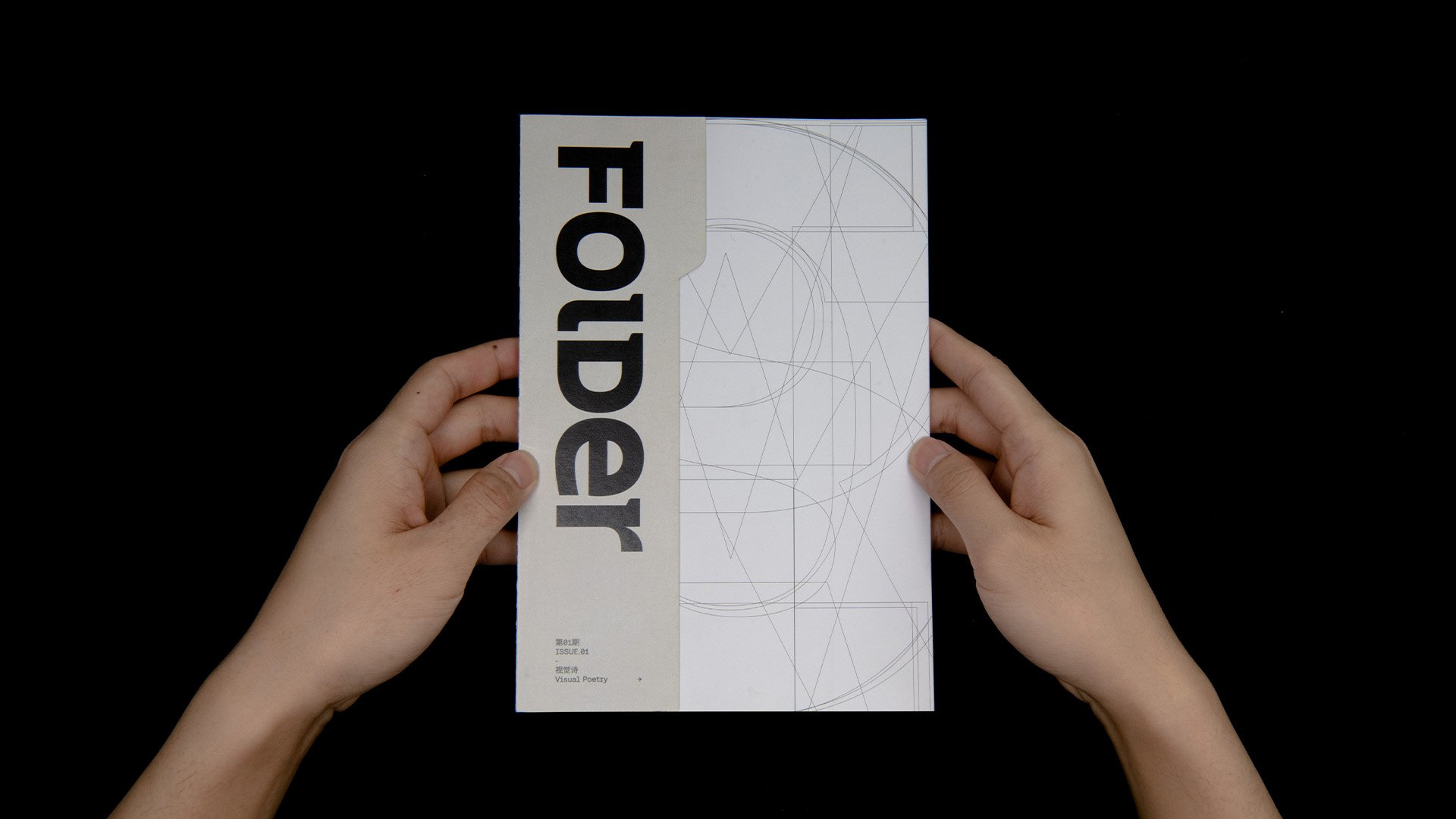
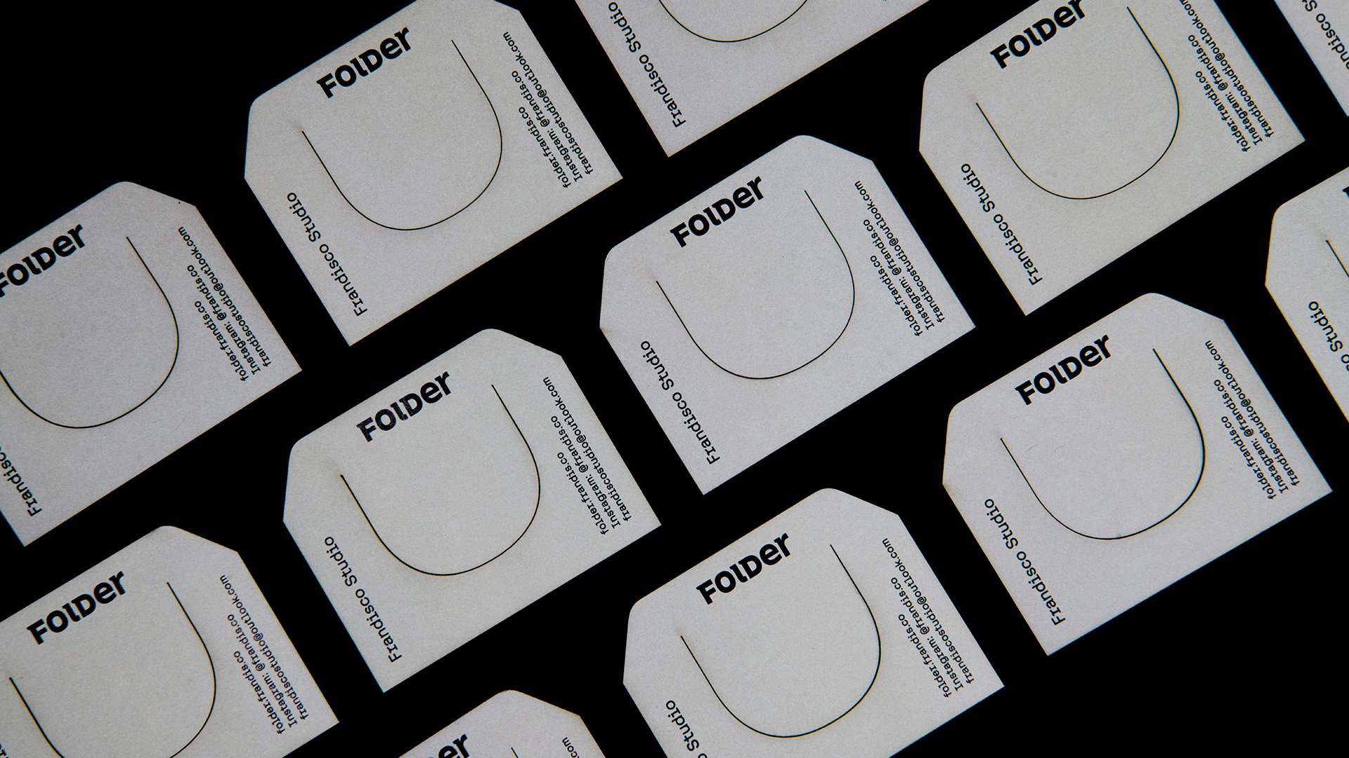
FolDer Magazine is a collaborative art and design magazine project, curated by Xin Ai and Elliot Zhang (me). In each issue, FolDer Magazine will propose a different theme for the participants to discuss and respond to with art or design work. The theme of the first issue is ‘Visual Poetry / 视觉诗’.
The concept behind FolDer Magazine is to create a platform to collect and showcase diverse artworks in response to the topics we care about as young designers and artists. To visually represent this concept, the FolDer logotype draws inspiration from typewriter style fonts, with a unique twist. The uppercase and lowercase letters maintain the same height, resulting in a clean and memorable design. Additionally, the FolDer logotype is a variable logotype with adjustable axes for weight and optical size, ensuring its versatility and sharpness when paired with text in various fonts and scales.

Frandisco Studio
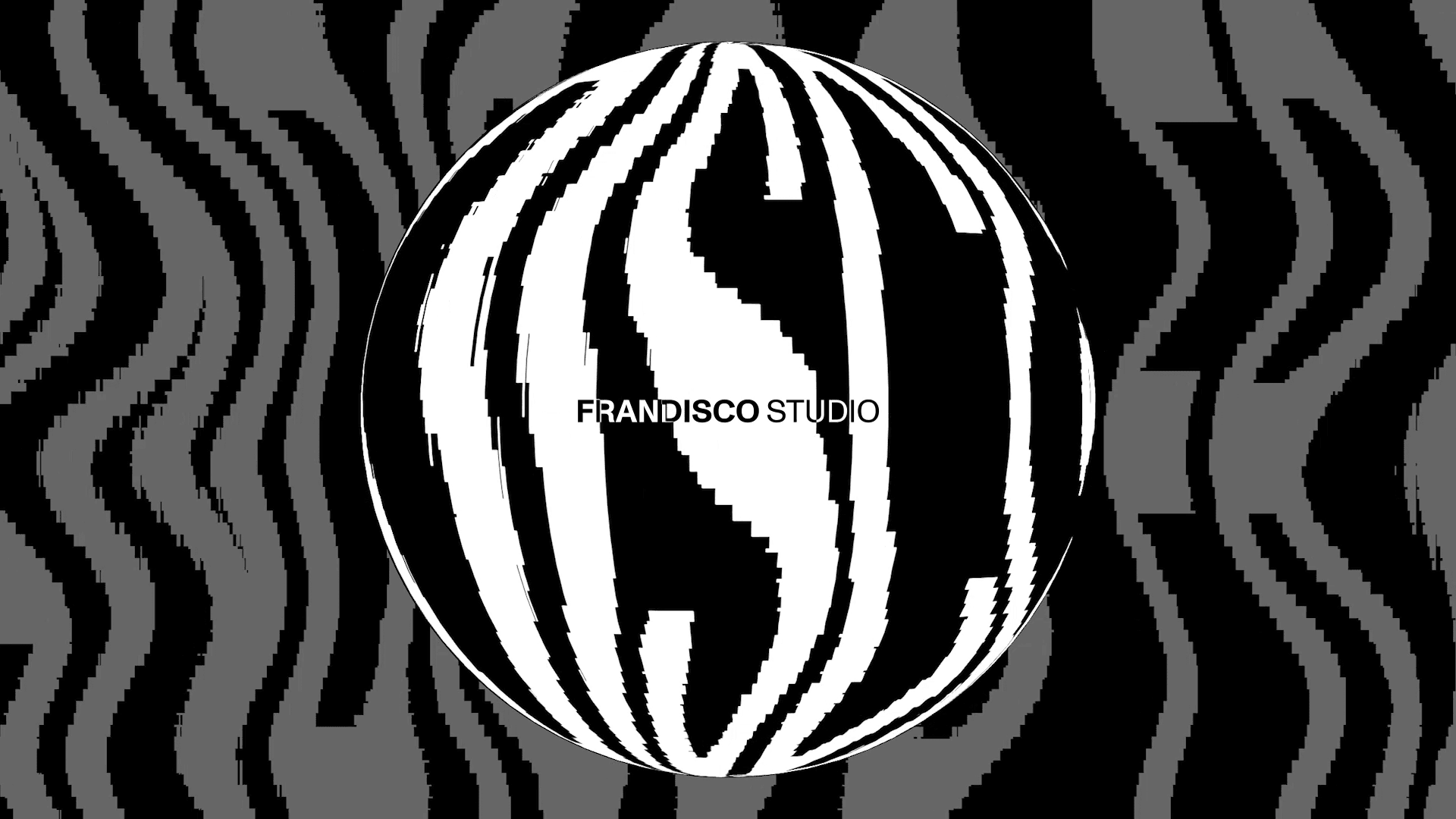
Frandisco Studio is an artist and designer’s collective founded by me and a few other friends. Our collective’s visual identity revolves around an ever-spinning disco ball, symbolising creativity at its core.
Much like how a disco ball reflects a dazzling array of lights, Frandisco Studio aims to reflect the diverse visions and interests of our members. We celebrate the unique perspectives and talents that each individual brings, coming together to create a harmonious fusion of art and design.
