Natalia Borrego Obrador
Biography
Hi there I am Nati,
a graphic designer specialising in typography. Typography is my true passion, and I have dedicated myself to studying its intricacies. I’ve crafted compelling layouts, exploring the perfect blend of typefaces and visuals. While typography remains my primary focus, I’m excited to delve into other design forms, like editorial pieces, and uncover how typography can enhance various disciplines. I’m driven by a constant desire to push the boundaries of typographic design and create impactful visuals.
Email address
moc.liamg@rodarbo.bnPortfolio
Life In Stillness Publication
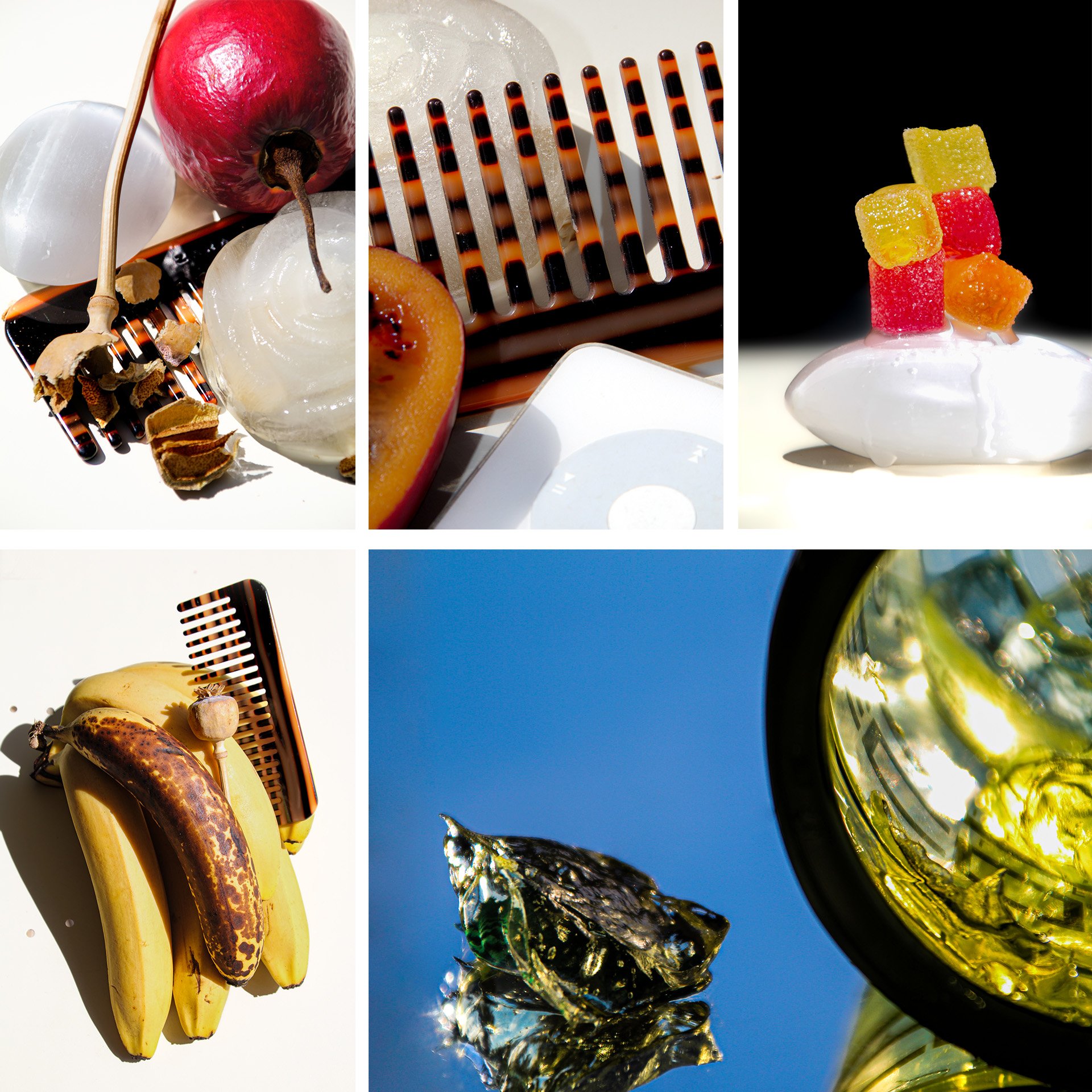
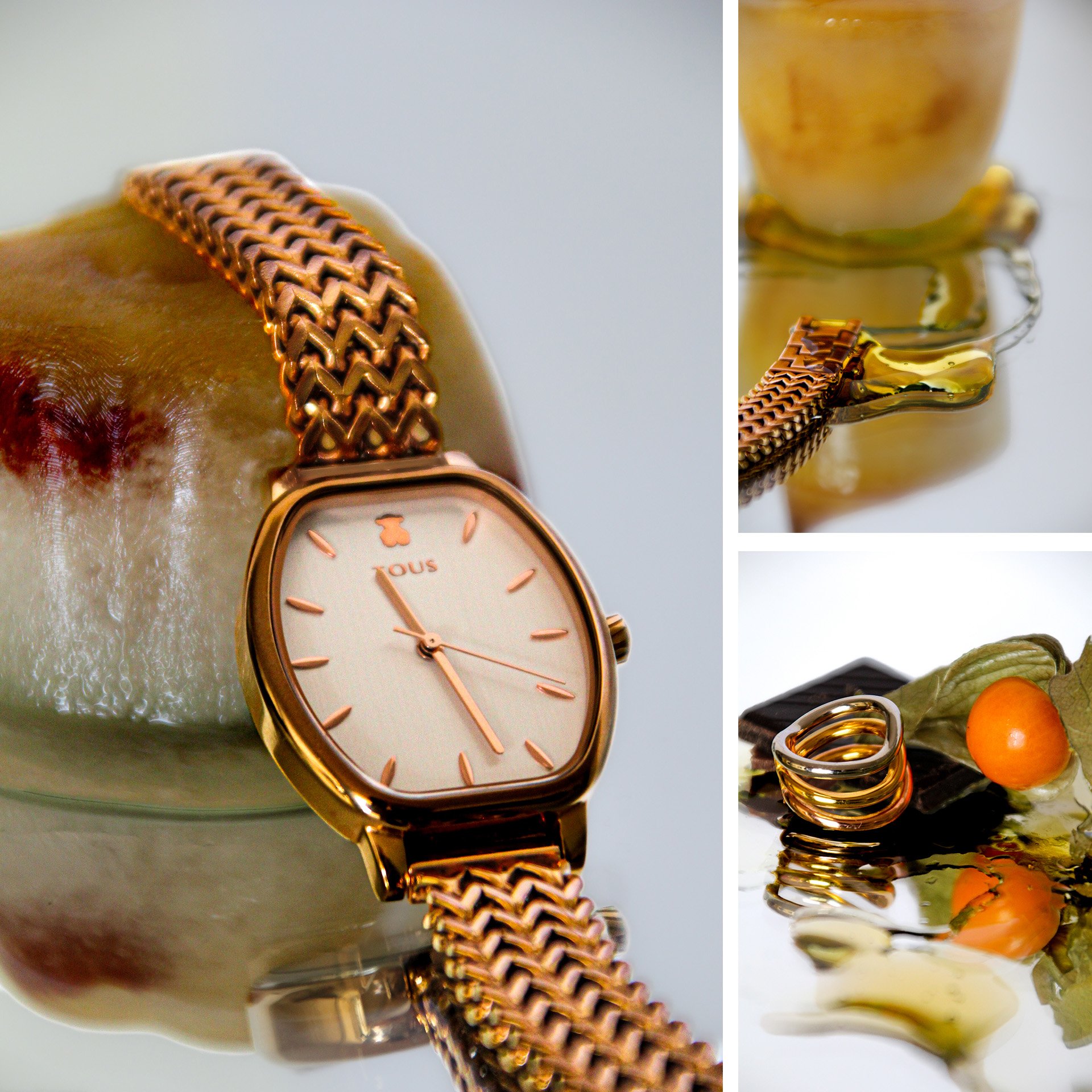
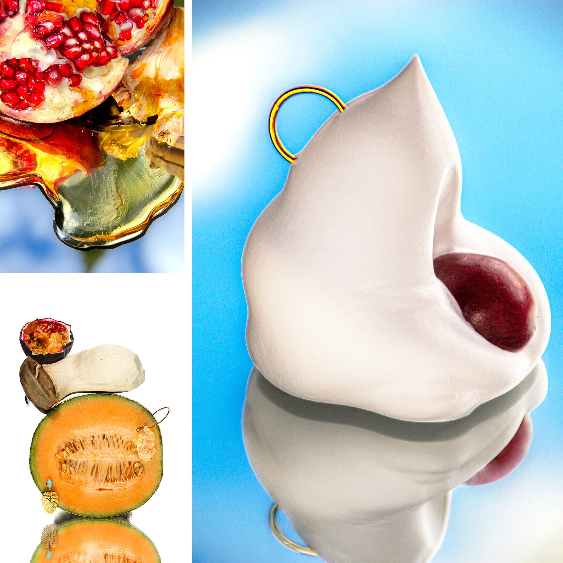
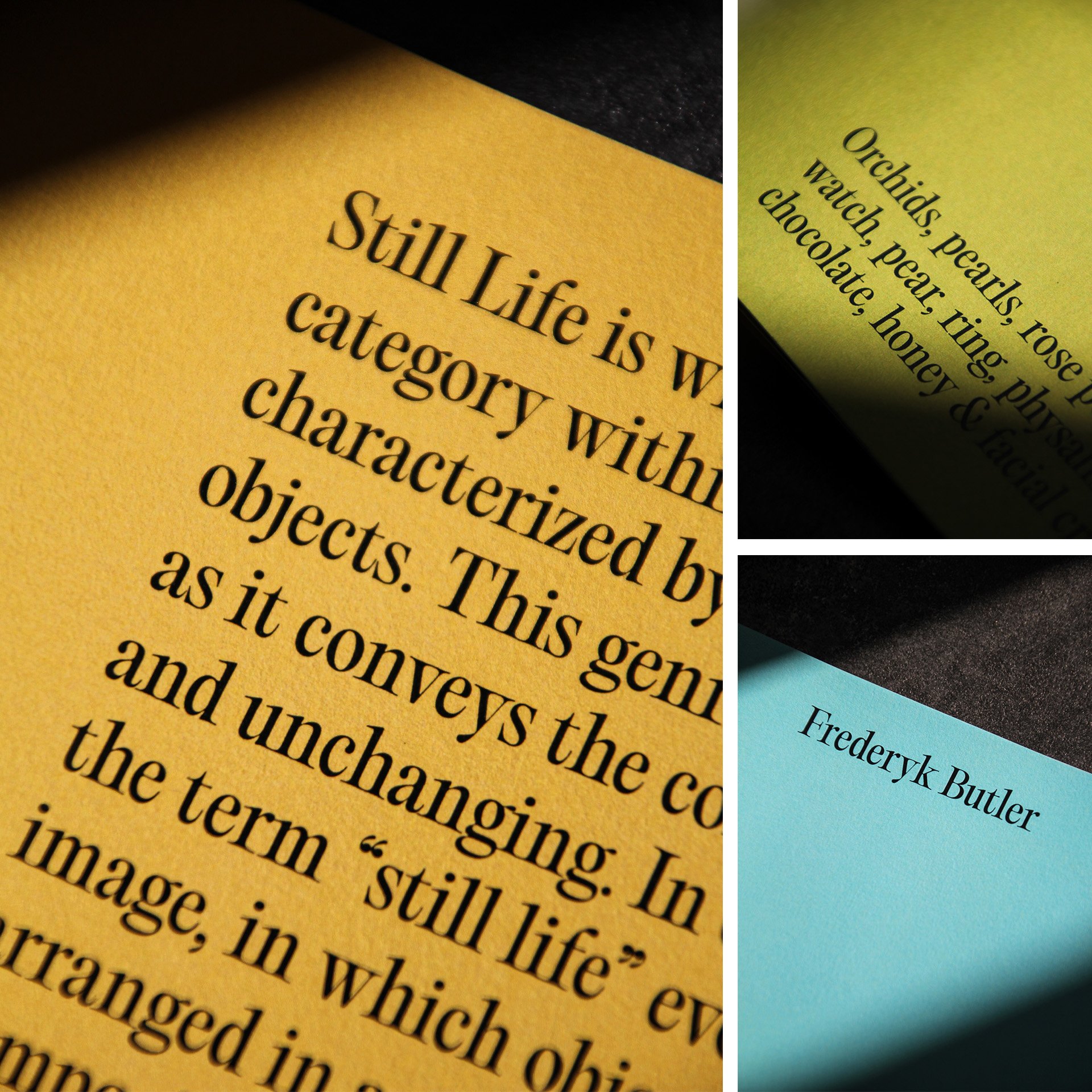
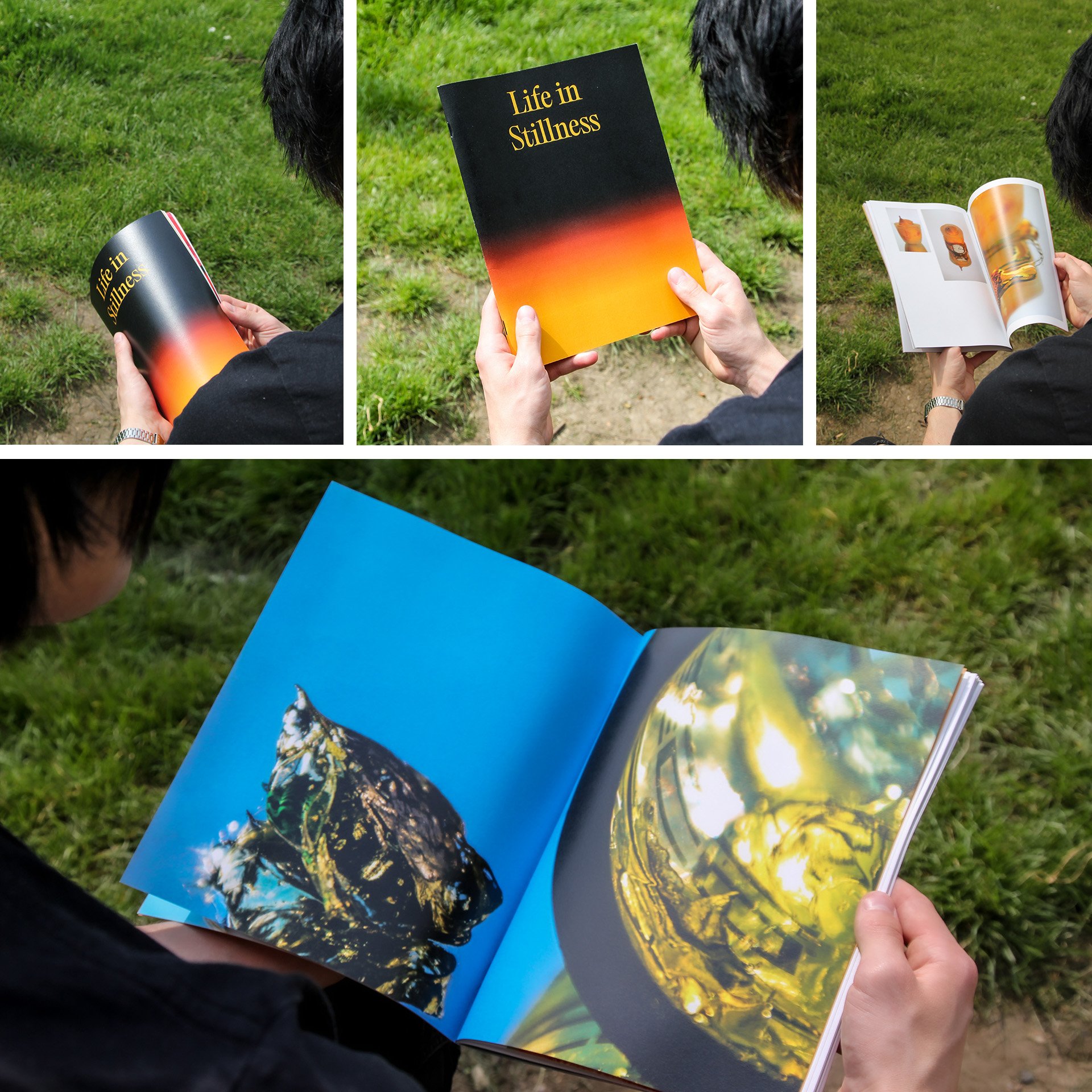
The purpose of my photographic magazine is to present a series of portraits that feature three individuals and their personal belongings, using a still life approach. The primary goal of this project is to visually capture the unique styles, scents, and personalities of the subjects. This will be accomplished through careful attention to lighting, textures, and composition, resulting in a compelling editorial piece that conveys the essence of each individual.
Throughout the process, I have incorporated certain objects that carry symbolic connotations, reflecting my personal feelings and associations with the individuals. This project serves as a medium of connection between myself and the subjects, as it provides a visual representation of our relationship and shared experiences.
Overall, the project aims to create a series of portraits that are both aesthetically pleasing and personally meaningful, capturing the essence of the subjects’ unique identities through a combination of still life photography techniques and personal associations. The result will be a magazine that not only showcases the subjects’ individuality but also evokes a sense of connection and meaning for both the subjects themselves and the audience.
Font Interpolations
In contrast to the previous editorial project, this one presents an opportunity to focus on the investigative, experimental, and developmental phases of the project, with the outcome remaining open until the conclusion of the study.
Initially, the decision to select diverse briefs aimed to challenge and intrigue, showcasing my proficiency in different working techniques. However, it inadvertently demonstrates my versatility in handling various project types, making it appealing to prospective employers.
For this particular brief, the task involved selecting two opposing points and delving into the exploration, documentation, and communication of the spaces that exist between them. This project served as a platform to gain a fresh perspective on typography, enabling me to understand it from a different angle.
My objective in this undertaking was to explore the multitude of techniques through which fonts can be interpolated. Through clear and concise visual representations, I aimed to demonstrate the transformative journey fonts undergo as they transition from one typeface to another. This project allowed me to deepen my understanding of typographic transformations and expand my skills in conveying them effectively.
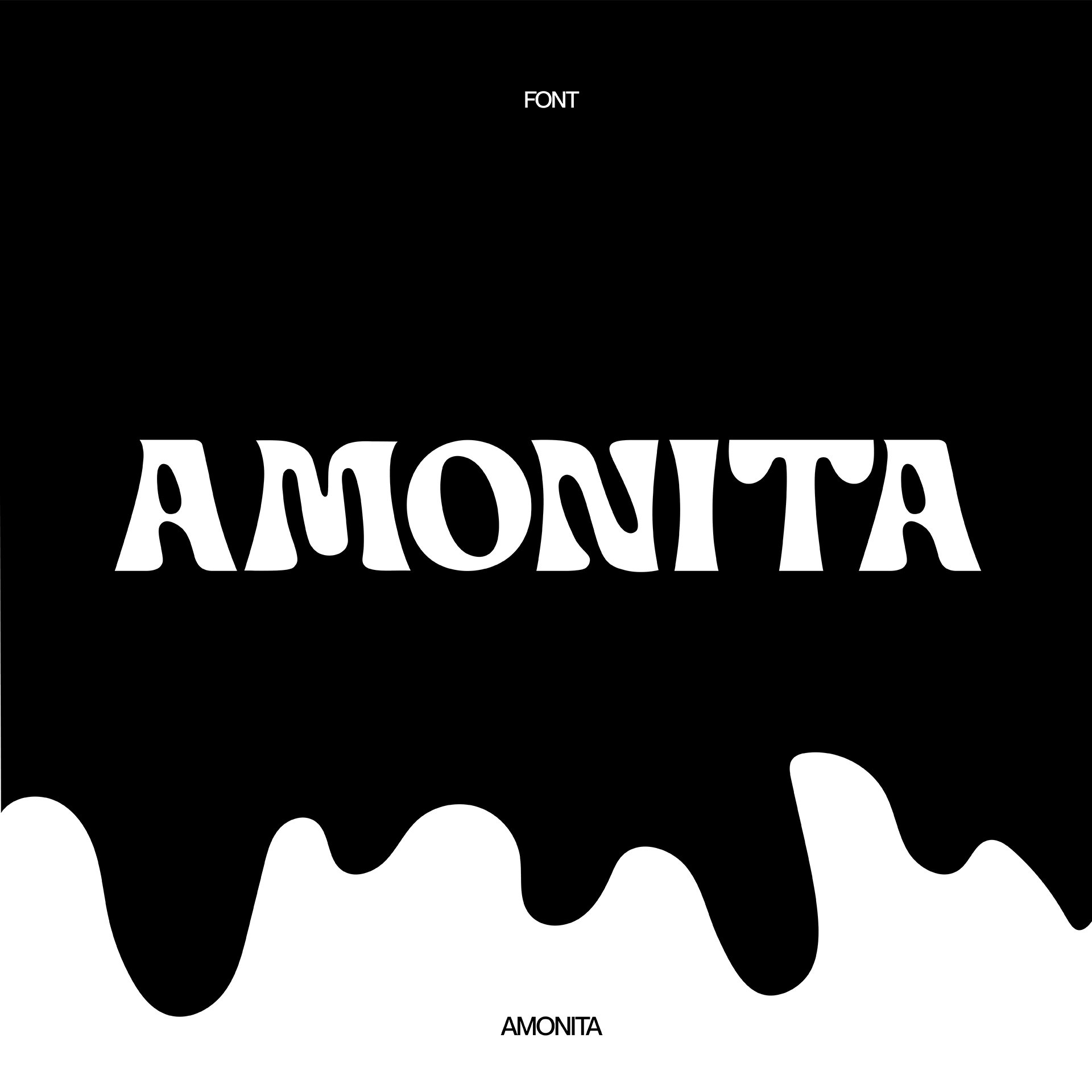
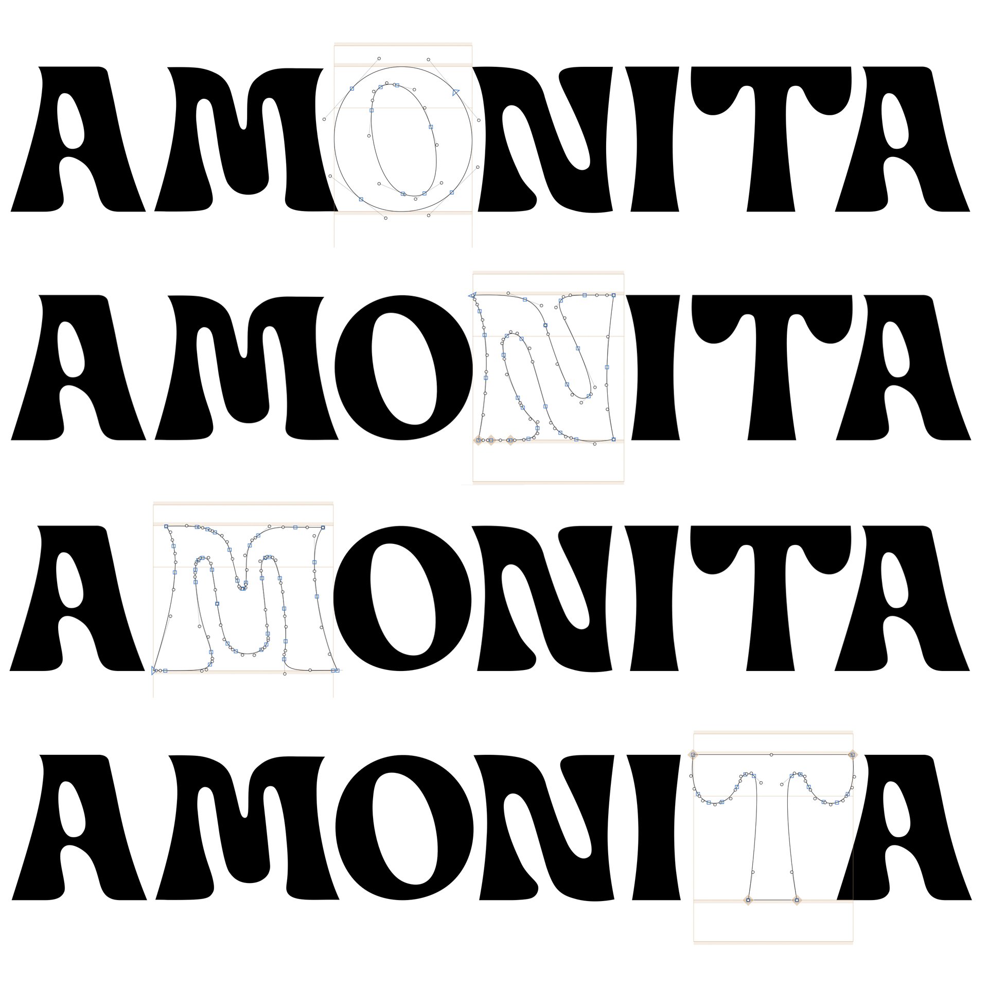
The following designs are some of the final outcomes of this interpolation study. The first design is a typography piece named “Amonita”, derived from the Spanish term for ammonite, symbolising the ocean. This typeface embodies fluid curves and dynamic movement. It was created through an interpolation process between two fonts: Blenny Black Regular and Guyon Gazebo Regular. I utilised Glyphs to meticulously adjust each letter, ensuring a cohesive and visually appealing outcome.
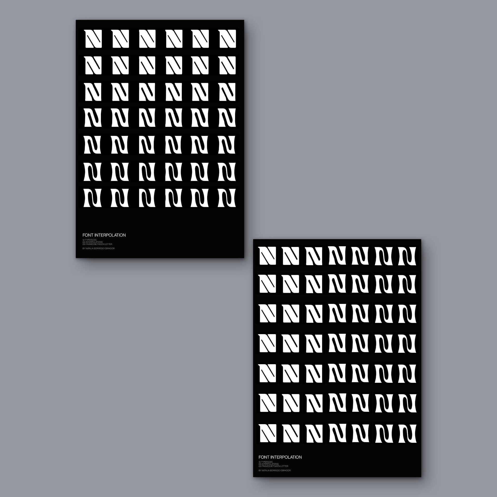
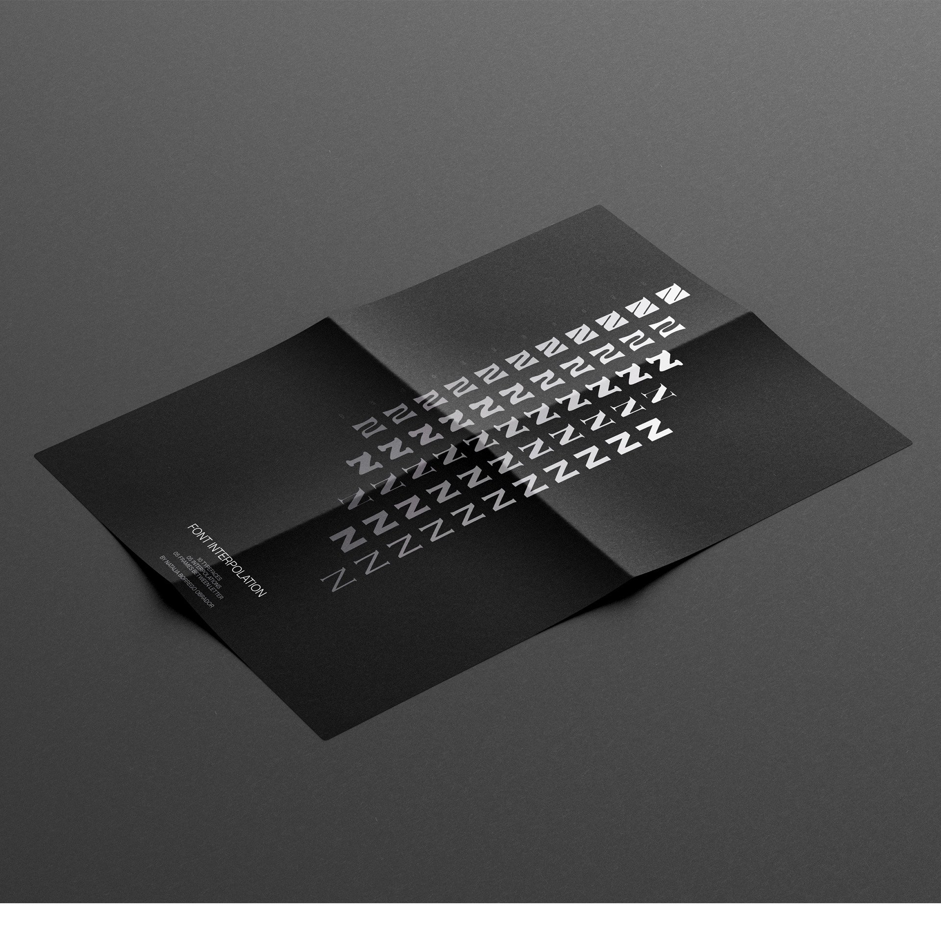
The second outcome encompasses a video composition showcasing five manual interpolations among ten distinct fonts, created using After Effects. To highlight the clarity of the interpolations, I captured screenshots of each frame and employed them in the design of an A0 poster. This visually captivating poster serves as a comprehensive visual representation of the interpolation process, enabling viewers to appreciate the seamless transitions between the font variations.
These final outcomes demonstrate the culmination of my interpolation study, reflecting the creative exploration, technical proficiency, and aesthetic sensibility applied throughout the project.
Metal Font
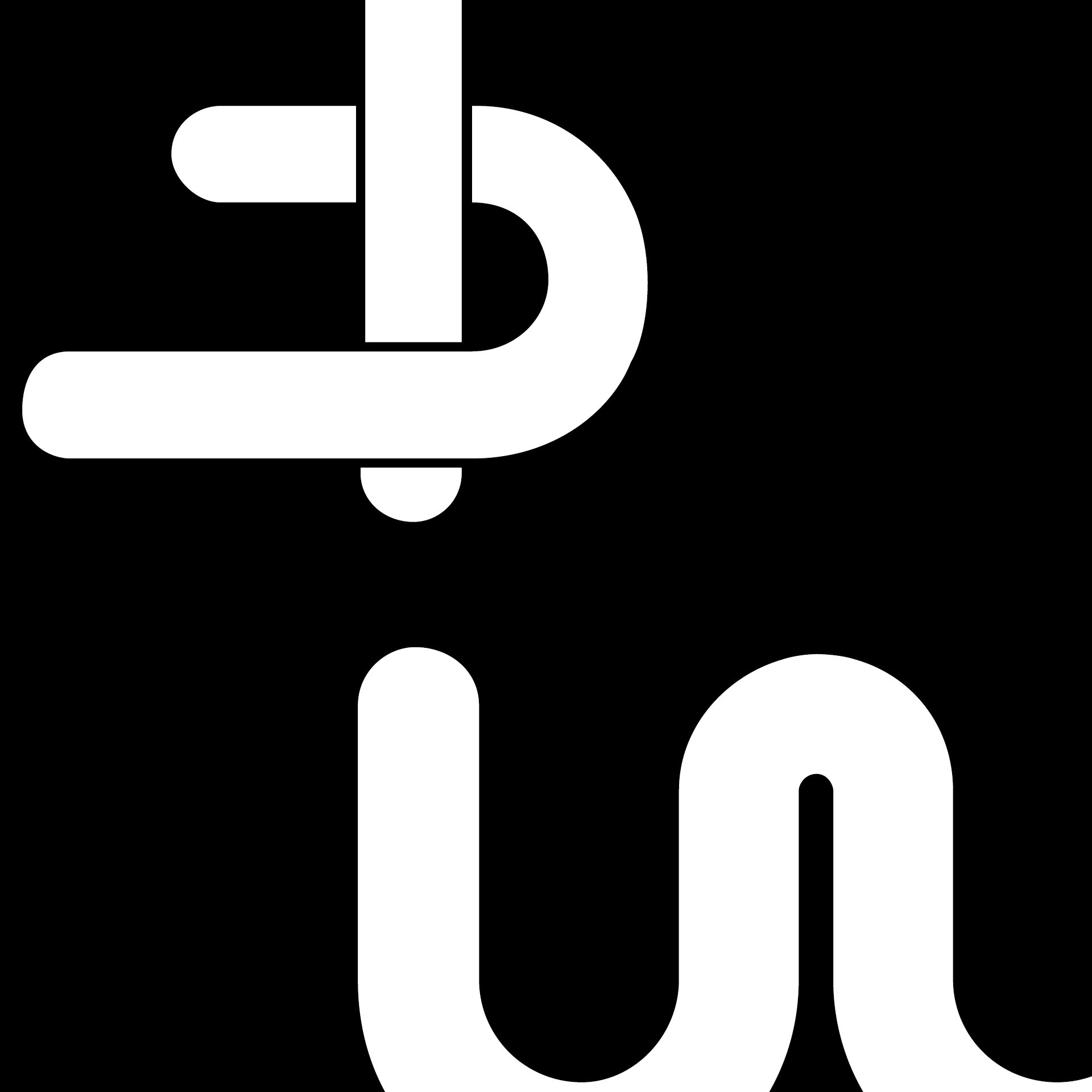
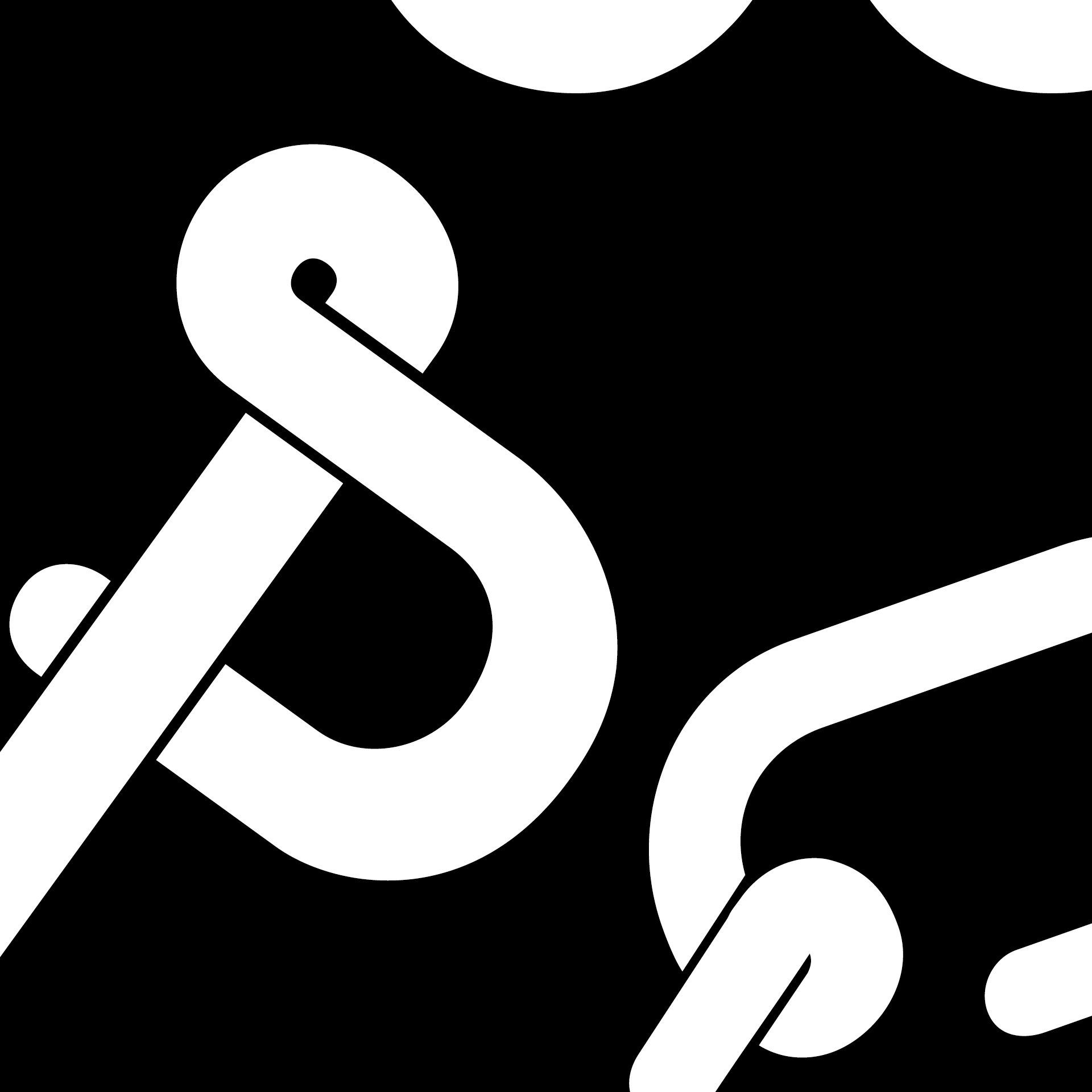
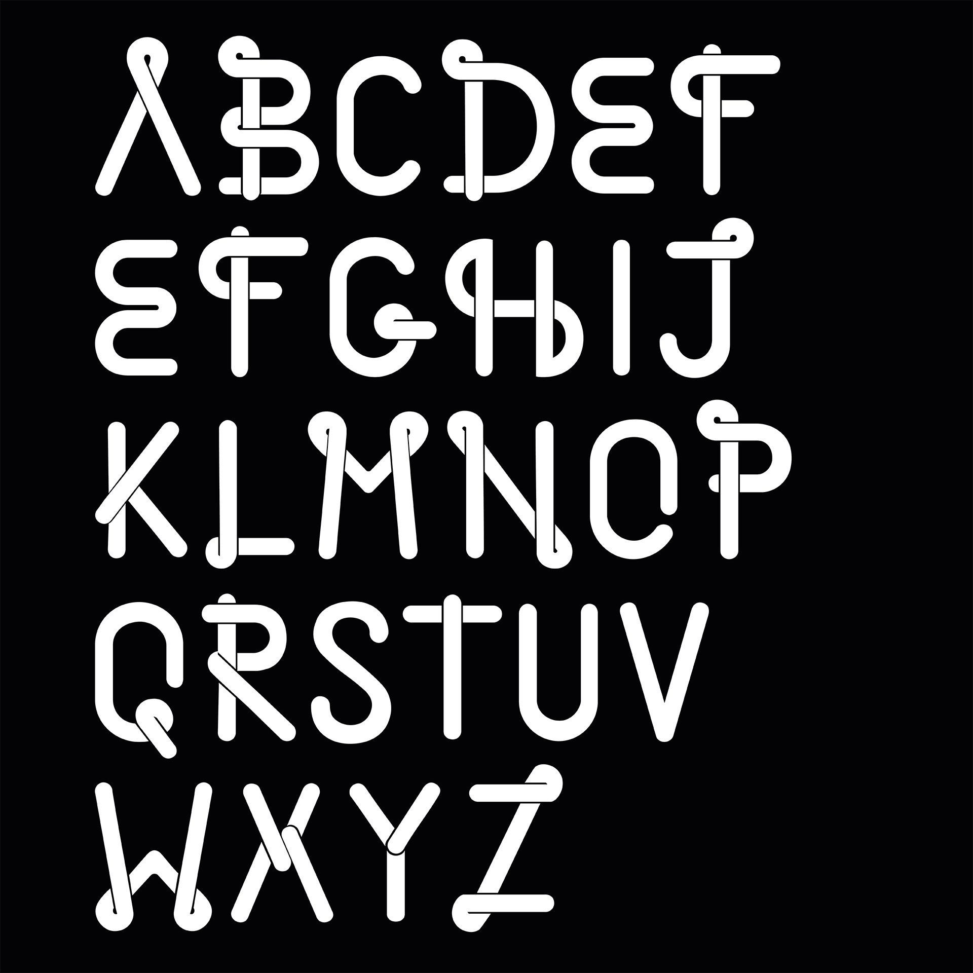
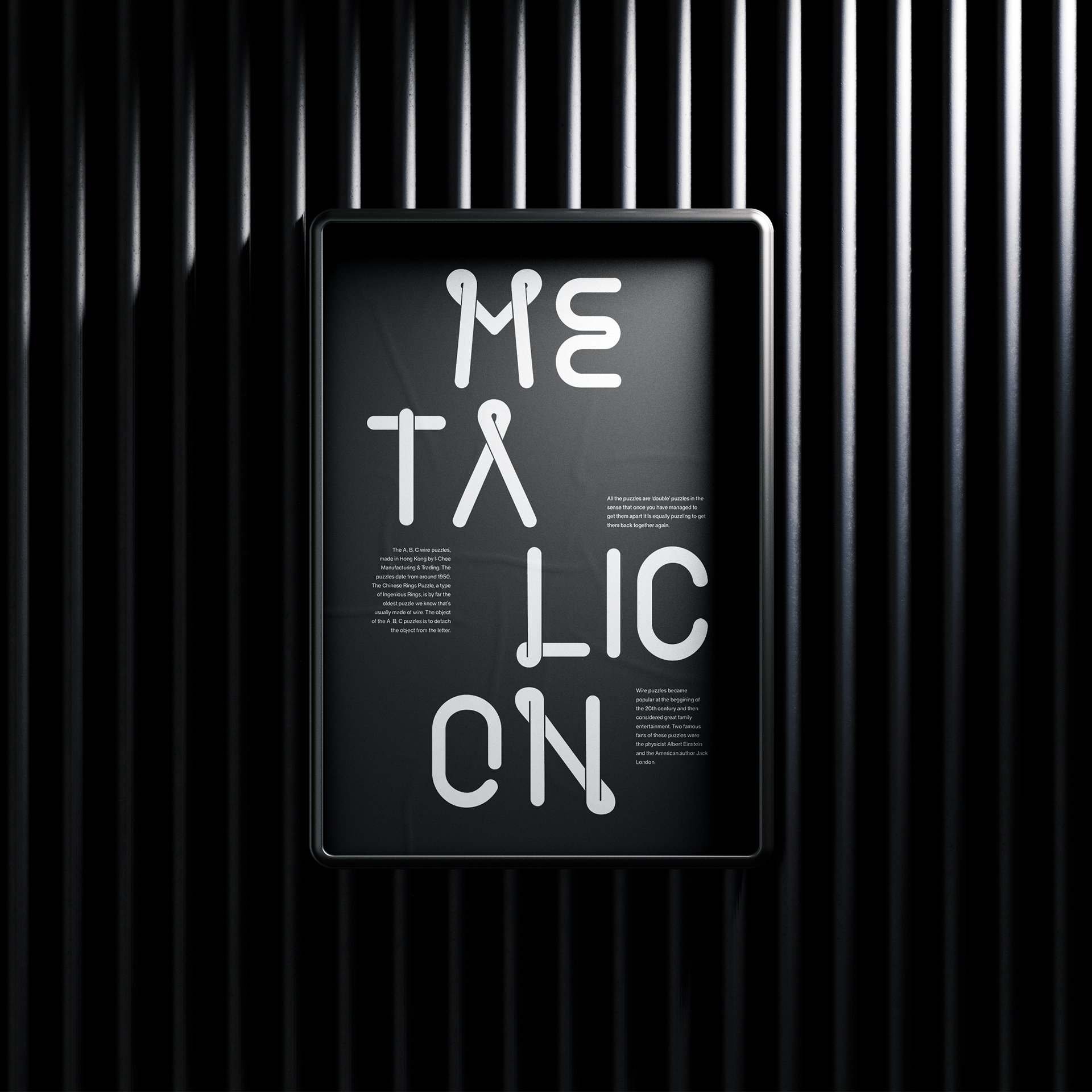
I embarked on the creation of a unique font inspired by metal puzzles, characterised by the intricate loops and straight lines that create illusions of depth. This project began towards the end of my second year of my Bachelor's degree and, after taking a break, I resumed it at the beginning of my third year. It represents my first foray into typography design, and although it is not yet fully completed, it has been a valuable learning experience.
During the process, I familiarised myself with Glyphs, a software specifically designed for font creation. Additionally, I attended typography workshops led by esteemed designer, Alessia Mazzarella, and extensively studied books such as “Designing Type” by Karen Cheng to gain a comprehensive understanding of letter anatomy and typography principles.
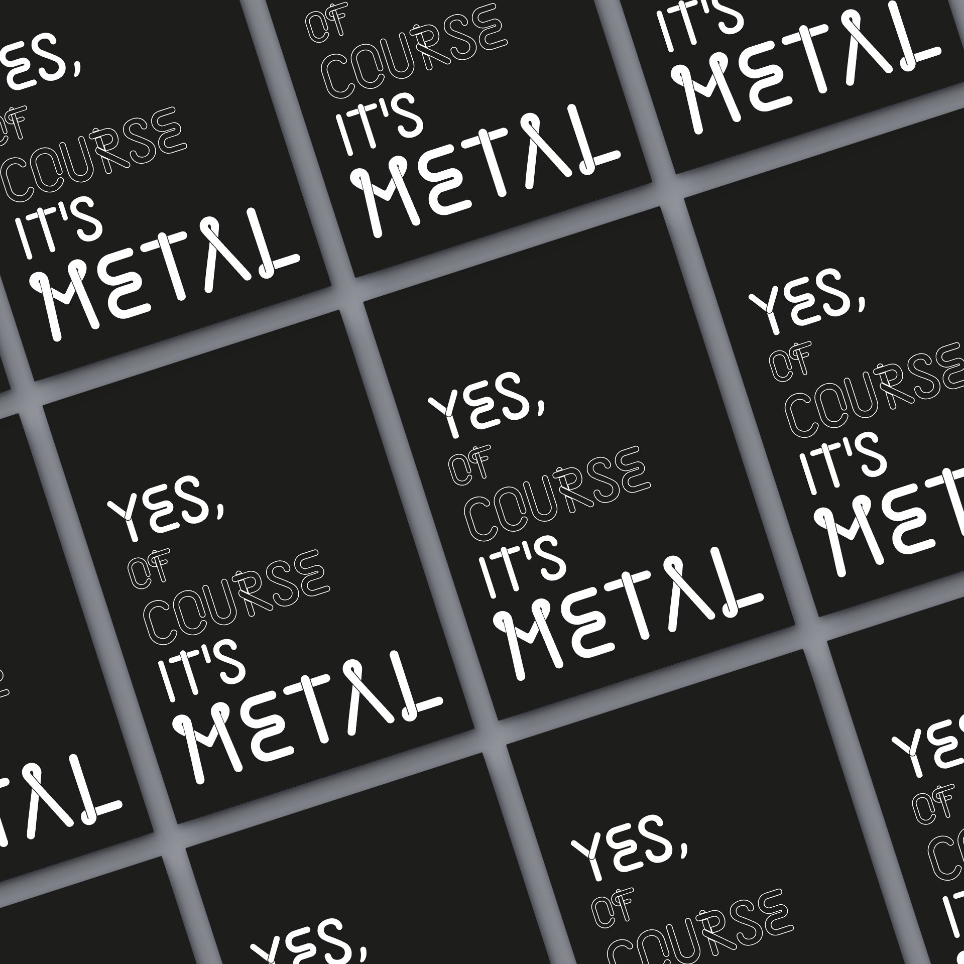
To tackle this project, I initially focused on designing the uppercase letters, as they were relatively simpler. It became evident early on that this typeface would be most effective at larger scales due to the complexity of each letter and the delicate negative space between the loops, which creates the illusion of depth.
One intriguing aspect of this font is its behaviour when colours are swapped. It undergoes a dimensional transformation, producing a captivating three-dimensional effect when placed against a black background. This unique characteristic makes designs utilising this font more eye-catching and tangible.
Upon completion of the font, I aspire to explore the realm of 3D software, using it to transform each letterform into a physical piece. This endeavour will provide further insights into the intricacies of my font and its distinct shapes, enriching my understanding of its design and potential applications.
